
Citi Singapore's Consumer Banking Website
Reframing the way the bank converses with its prospects and customers

Project Overview
This marks my first project ever as an Interaction Designer with Accenture Interactive, who has partnered with Citi Singapore to embark on a transformative journey beginning with a pilot homepage revamp.
The team's ambition is to elevate the consumer banking site as a key enabler, guiding new consumers on a journey of growth and prosperity with Citi.
Timeline
July – September 2021
Team
Design Manager
Visual Designer
Interaction Designer (Me)
Contribution
Experience Benchmarking
Interaction Design
Tools
Sketch
Sharpies and Post-Its
Problem Discovery
The original website experienced several issues: a complex and deep information architecture; a promotion-heavy tone of voice that lacks customer-centricity; constraints of a single-viewport design; and increased cognitive load required that make it challenging for prospects and customers to understand and engage with the bank's offerings effectively.
During the initial stages of the project, I conducted a heuristics review of the existing website. Some of the key problems identified with the site included:
Information architecture complexity: The original website suffered from a cluttered and confusing information architecture, featuring multiple layers of navigation that made it challenging to find information quickly and efficiently. The menu bar also had duplicated or defunct links.
A marketing-centric tone of voice: The original tone of voice throughout the website was heavily skewed towards marketing, focusing primarily on selling rather than addressing one's financial needs and aspirations.
Limitations of a single-viewport design: The homepage's single-viewport design restricted storytelling and dynamic content presentation, hindering user engagement. Such a design constraint limited the user's ability to engage with the website's content fully. On top of that, the site is not responsive nor optimised for mobile.
Increased cognitive load: Users had to navigate through different pages of similar products to learn about them individually, which increased the cognitive load. The absence of comparison tools further hindered users' ability to make informed decisions and compare different products or services effectively. (This contrasts with third-party aggregator sites that facilitate comparisons of similar products/services offered across various banks.)
The aim was to enhance the user experience, streamline functionality, and improve content presentation, while reducing cognitive load and facilitating informed decision-making with the inclusion of relevant tools.
Context / Research Methodology
Given the constraints of not having direct access to the bank's existing customers for interviews (as user testing is out of project scope), the research process relied on secondary sources to gather insights.
Heuristics evaluation: Performed based on the 10 Usability Heuristics for User Interface Design from Nielsen Norman Group.
Competitive benchmarking: Together with my design manager/mentor, I analysed the websites of leading banks and financial institutions to benchmark Citibank's website against industry standards and identify opportunities for differentiation.
Establishing Guiding Principles from Insights Gained
Insights from the heuristic evaluation and competitive benchmarking were synthesised to establish five guiding principles. These principles serve as the cornerstone for revamping the website experience and guiding the new strategic direction.
The five guiding principles were:
Guidance: Guide users to fulfilment of desired actions
Understand: Keep messaging jargon-free and complemented by relevant visuals/tools
Compare: Allow comparison of products/services
Align: Adopt an approach that aligns closely with users' goals and mental models
Relate: Share experiences and stories with a human touch
Ideating Together, and Getting Buy-In
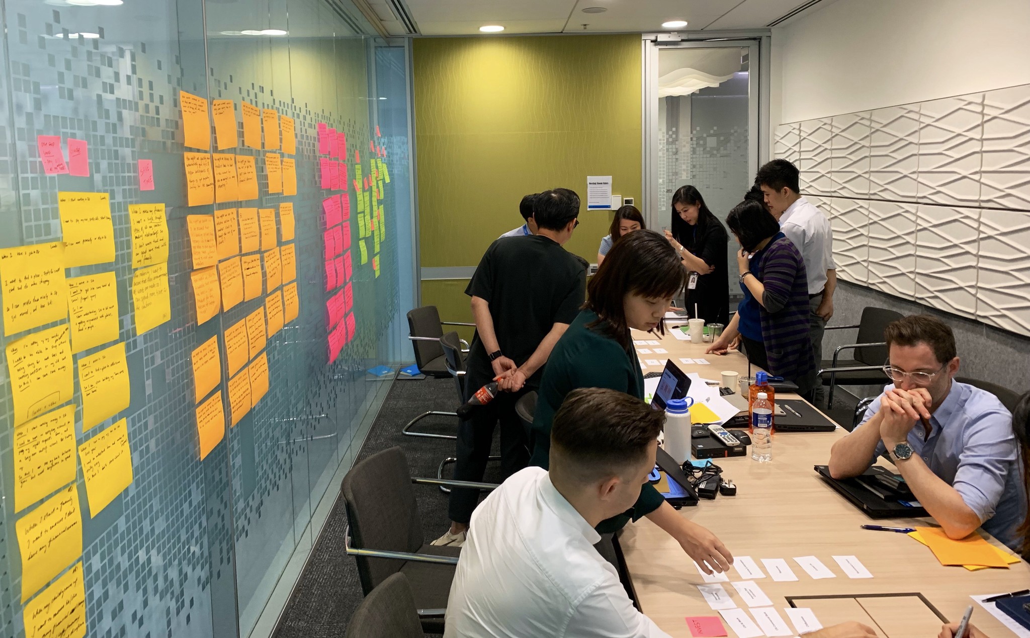
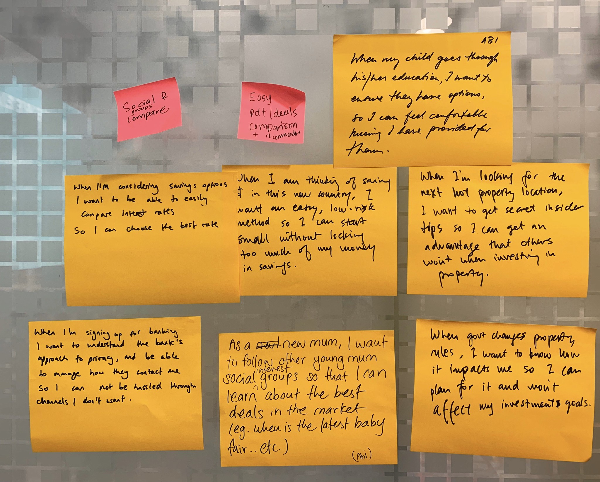
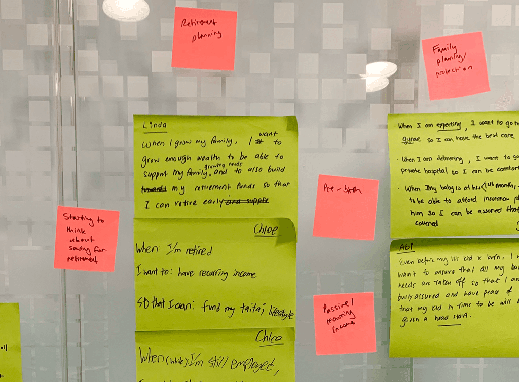
Led by my design manager, we conducted a design thinking workshop with the goal of elucidating the core financial needs and aspirations of Citi's customers.
To address some of the problems as highlighted above, key activities were undertaken to explore a more needs-based approach and improve the navigation structure:
1. How-Might-We exercise: This exercise aimed to delve into the core needs and expectations of people who bank and/or invest. The team identified primary concerns and aspirations of the bank's customers, such as financial security, retirement planning, family planning, education savings, and home-related financial goals.
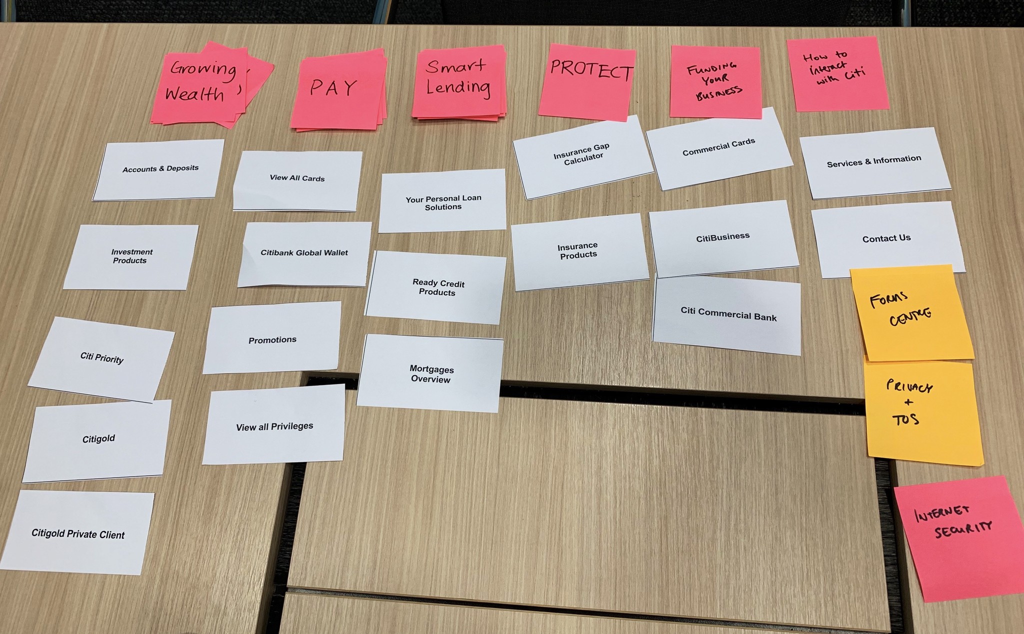
2. Card sorting for information architecture improvement: Card sorting was employed to evaluate and refine the existing information architecture. The objective was to streamline the navigation flow, eliminate redundancies, and create a more intuitive and user-friendly structure for the website.
The participants included staff from diverse departments such as sales, marketing, operations, and customer service, contributing a variety of perspectives to our collaborative exercise.
Translating Insights into Wireframes as Informed By These Insights
Building on the insights synthesised from our design thinking workshop and the findings from our secondary research phase, I embarked on the process of proposing design mockups and wireframes.
The insights gathered not only shaped our design approach but also conferred greater confidence in our design decisions. Our design rationale was guided by principles distilled from a survey of other banking websites, ensuring a user-centric approach and aligning with industry best practices.
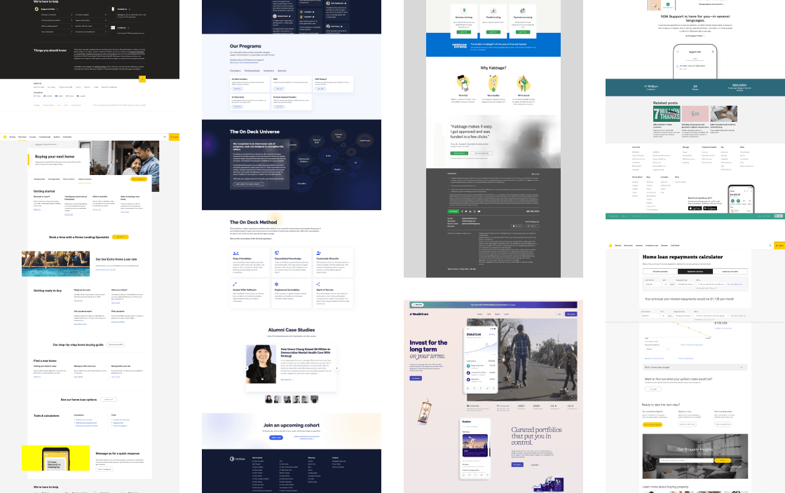
The following are the proposed designs relative to the original ones:
Homepage
Original: The original homepage was intentionally kept concise within a single viewport, featuring a 4-rotator feature that highlights four different products, services or promotions.
Proposed: The redesigned homepage adopts a longer, vertical-scrolling format. At the top, within the first fold, we introduced a needs-based recommender, allowing users to quickly input their desired needs and navigate to the relevant pages. This is followed by a quick access bar featuring the most frequently accessed items. Promotions have been moved to the second fold, as we hypothesised that this space is more valuable than the first fold, given that users are accustomed to scrolling.
SUPPORTING OUR DESIGN DECISIONS WITH INSIGHTS FROM PAST STUDIES DONE
Designed for information foraging and discoverability.
While user testing was not conducted due to project constraints, our design decisions were informed by insights from secondary research.
To justify our decision to move promotions from the first fold to the second, we relied on insights from NNG (see video below). Additionally, we observed that users tend to scroll almost immediately and naturally on mobile devices, making the second fold potentially more valuable than the first.
Furthermore, we transitioned from a shorter format to a longer, vertically-scrolling page to enhance storytelling and content discoverability, aligning with users' increasing preference for scrolling.
Products Overview Page
Original: The original page displayed separate links to all the respective local currency accounts in a grid format, requiring users to click on each one individually for details. Without a means to compare between accounts easily, this translated to high interaction cost and cognitive load on the part of the users.
Proposed: The redesigned page showcases the top 3 accounts side by side for easier comparison, with upfront details like interest rates and customer success stories further down to aid decision-making. Additionally, we tailored recommendations for specific user groups based on the different financial journeys they are on (i.e. Product A for those starting a business, as compared to Product B for those planning to save for their children's higher education).
Products Details Page
Original: The original page was concise, but this led to nested information within multiple tabs. Users had to click on them individually to access details such as "How It Works," a graph showing the "Moving SIBOR rate," and read the "FAQs." The Terms & Conditions section was challenging for laypeople to understand as well.
Proposed: At the outset, users can easily grasp how the product works, with key features and benefits prominently highlighted. We integrated an interactive calculator for users to estimate and visualise potential gains over time. Additionally, we've introduced a social proofing section to feature user testimonials. The FAQs have been rephrased in a more layperson-friendly language to enhance comprehension.
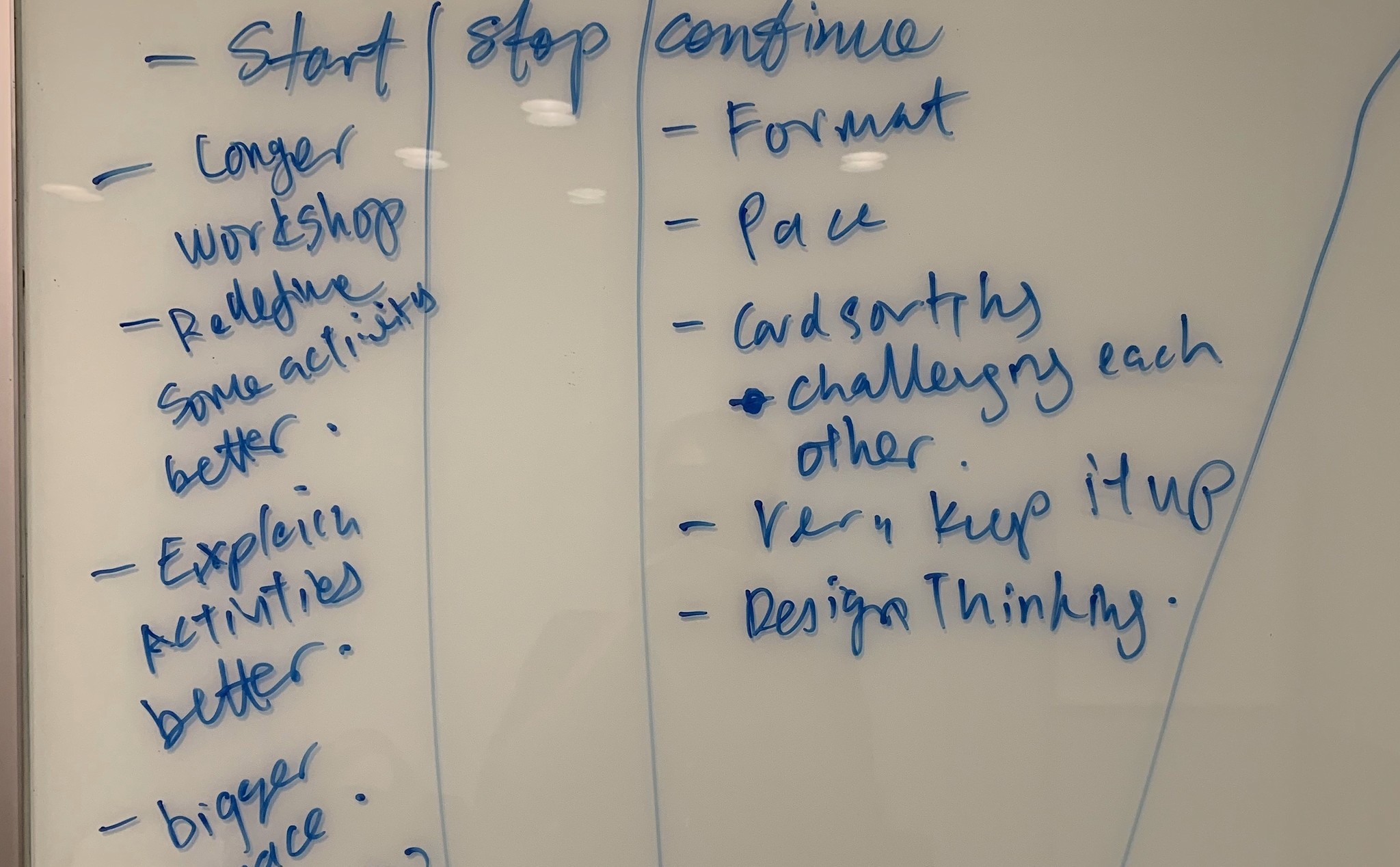
Takeaways
User-centred design at the forefront
Being part of this project as my first endeavour with the company, and my first foray into the world of UX/UI, I appreciated firsthand the significance of user-centred design principles and the impact they can have on enhancing the user experience.
It reaffirmed my belief in the importance of empathising with users and tailoring designs to meet their needs and expectations.
Shifting the lens and conversation
By encouraging participants to reflect on their own financial journeys and insights from customer feedback, we collectively shifted the conversation from a product-centric to a goal-centric approach.
Such a shift is essential as it goes beyond a website design piece — more so, it is a rethinking of the service culture. Just as a teller attentively listens to every valued client at the bank's counter, our aim is to foster a culture that genuinely understands and prioritises the financial goals and needs of Citibank's customers.
The value of collaboration and mentorship
Being part of this project as my first endeavour with the company, I deeply appreciated the collaborative environment and guidance from my mentor. It reinforced the importance of teamwork, communication, and mentorship in fostering innovative and effective design solutions.
I'd like to take this opportunity to thank Will L. for his support and guidance on this journey.
Impact
Although precise metrics are not available due to me leaving the company prior to any conclusive evaluations, the UX improvements implemented during my time at the company are estimated to have positively improved user engagement and satisfaction.
Intuitive User Experience
with clear, consistent microcopy.
Established design system
allowing for greater conformity and scalability.
Streamlined User Journey
reducing friction and enabling faster task completion.