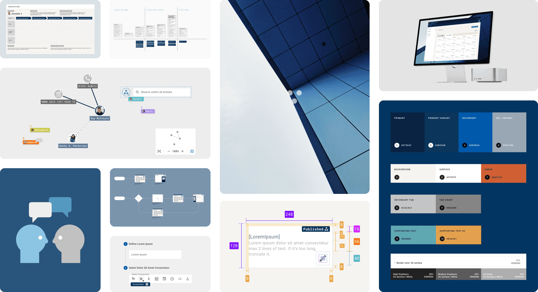
CASE STUDY: PRODUCT DESIGN
Fieldwork* — From Legacy Complexity to Guided Clarity
*To respect project confidentiality, certain technical specifics and proprietary details have been generalised or omitted. Some sections are intentionally kept high-level. This case study focuses on the underlying interaction logic and system transformation rather than implementation specifics.
Timeline
October 2021 – April 2022
Fixed Contract
Team
Product Manager, Backend Developer, Frontend Developer, and me (Product designer)
Contribution
First and only Product Designer. Took the team from no design process to a scaled one.
CONTEXT
Network investigation runs on legacy software that hardly anyone enjoys using
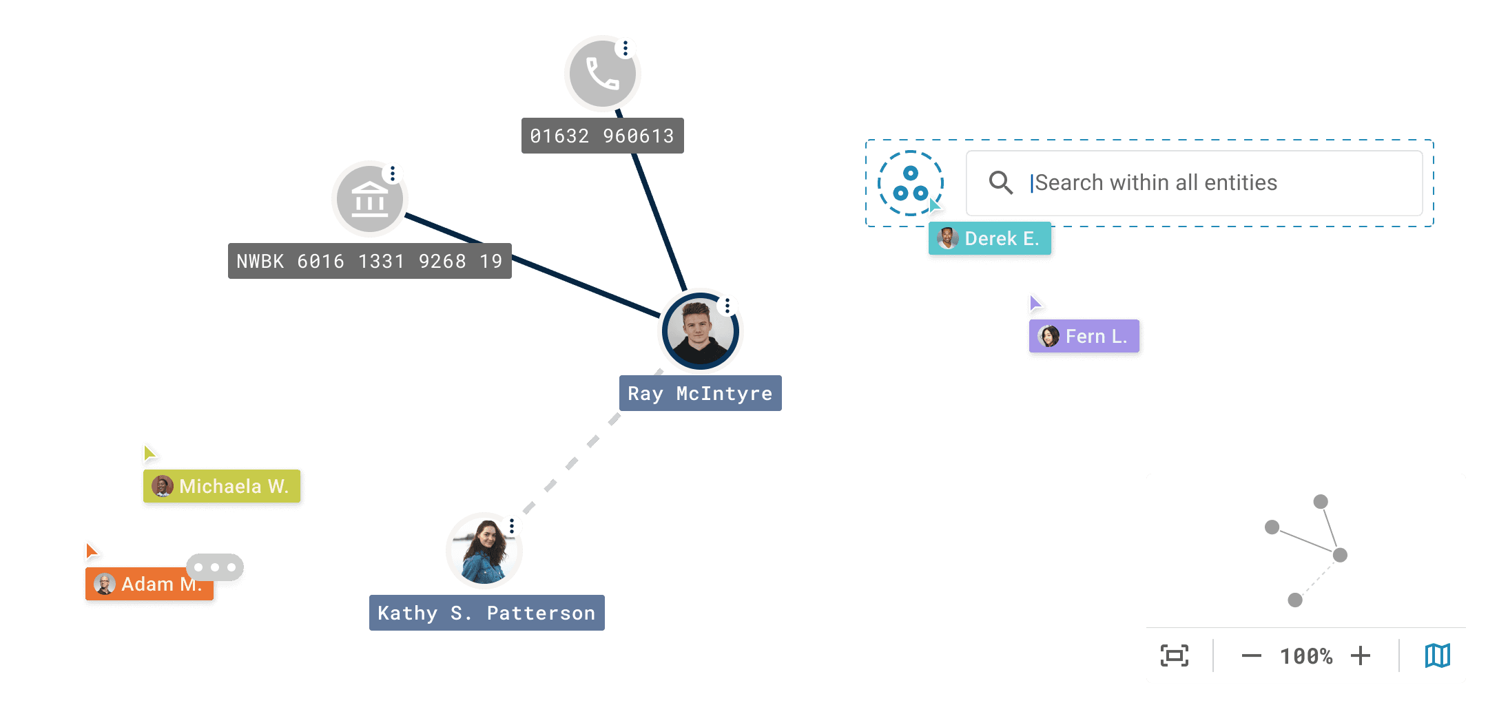
Fieldwork is the tool that powers a network analysis platform, and it is used by analysts and field investigators to map how entities such as people, places, and events are connected. Before any of that data can exist, someone has to define its structure: what kind of information goes where, and how each piece relates to the next. That someone is a database schema designer, and that's what this tool is built for.
The tools that dominate this industry were built decades ago — before modern interaction patterns, before responsive design, before anyone expected enterprise software to feel intuitive — and Fieldwork is no different. Analysts have to learn them through years of use and recall, rather than through good, intuitive design. This startup saw an opportunity to build something better, and I was brought in to do that.
DISCOVERY
Understanding the problem before proposing the solution
Before proposing anything new, I needed to understand what I was dealing with. I ran a heuristics review — a structured evaluation of the existing interface against established usability principles — to catalogue the problems.
What I found:
Inconsistent components with no underlying design system
Technical jargon used where plain language would do
No review stage before database changes were pushed live — a misclick could corrupt thousands of records with no easy way back
Even the product team couldn't explain certain features with confidence. Some functionality had accumulated over time without ever being properly documented.

A recreation of the type of legacy software that dominates the network analysis space — dense, jargon-heavy, and built for a web era long past.
UNDERSTANDING WITHOUT DIRECT ACCESS
No access to real users — so I had to find another way in
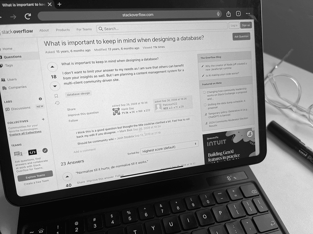
A core constraint: I couldn't interview actual users. Database schema designers worked on confidential client projects, so access was restricted. Rather than design from assumptions, I took a secondary research approach — studying communities like Stack Overflow and Reddit, reviewing competitive tools, and mapping the mental models that schema designers typically use.
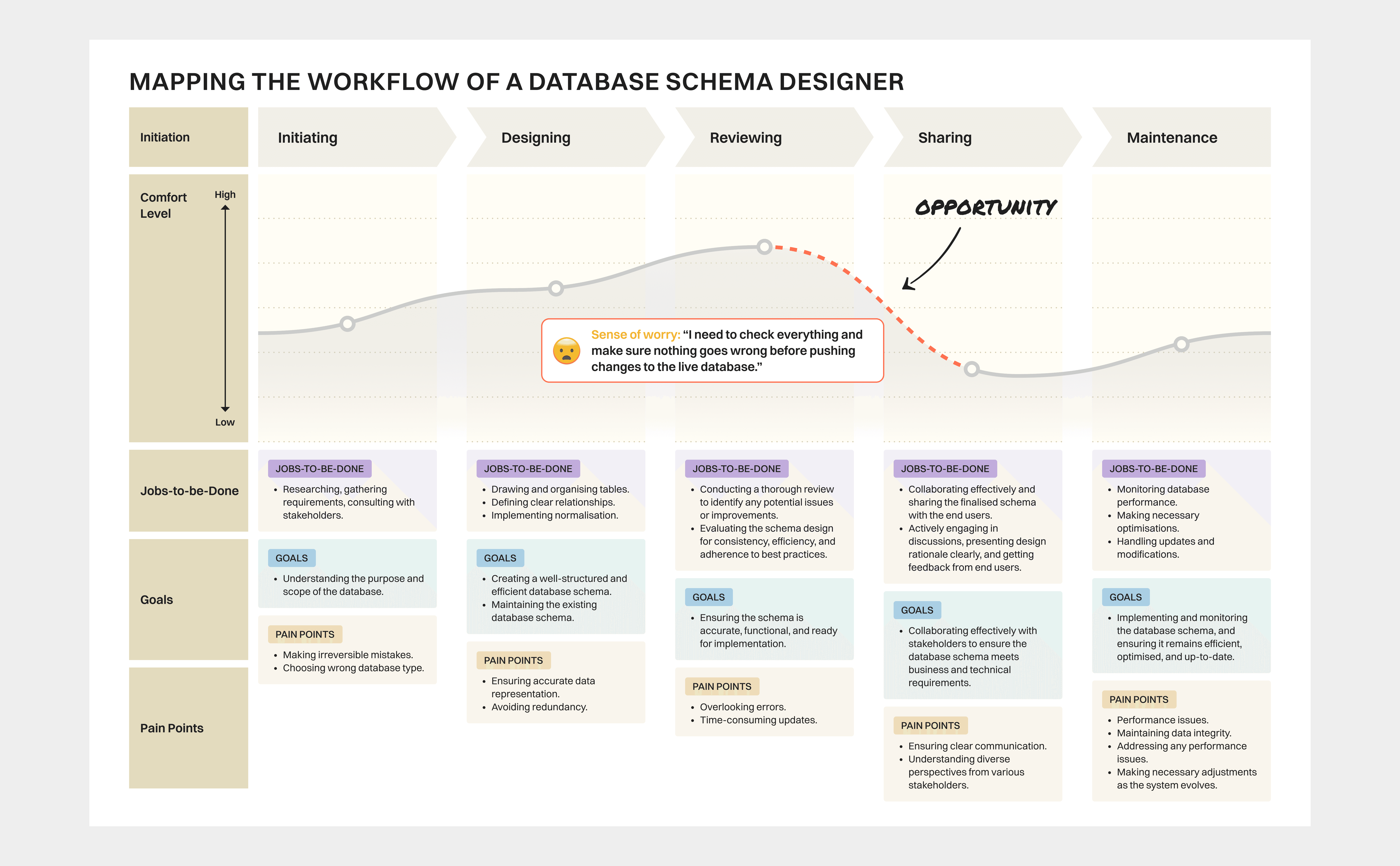
This gave me a grounded picture of their priorities: precision, confidence before committing, and the need to understand system state at a glance — not piece it together from dense table views.
Internal team members stood in as testing proxies. Their feedback wasn't a perfect substitute, but it was structured and honest — and it surfaced the most important insight of the project.
THE INSIGHT THAT CHANGED DIRECTION
One wrong move, thousands of broken records
During feedback sessions, a single observation reframed everything: pushing changes to the database is not easily reversible. One schema alteration can cascade across thousands of existing records.
The original tool offered no protection against this. You'd fill in a small popup, hit confirm, and the change was live. No review. No preview. No safety net.
This shifted my design question from "How do I make this faster?" to this: How do we help schema designers feel genuinely confident before they commit a change that can't easily be undone?
HMW better enhance the confidence of database schema designers just as they are about to finalise and publish their proposed edits to the database?

THE SOLUTION
Build, then verify with a WYSIWYG (What You See Is What You Get) two-stage workflow before pushing it to live
The 'before'/'as-is' images are omitted here to respect project confidentiality. Only the redesigned screens images are shown.
Stage 1 — Guided Assembly
Designers define their schema components through an intuitive form-builder style interface: field labels, data types, whether each field is required or optional, single or multiple selection — all in plain language, no jargon. Familiar mental model, lower error rate at entry.

Stage 1: Guided assembly. The field builder uses progressive disclosure — showing the full list of added fields on the left for orientation, while keeping focus on one field at a time on the right. Structured, uncluttered, no cognitive overload.
Interaction concept shown as a wireframe. Actual product screens withheld at the client's request.
Stage 2 — Visual Confirmation Before Publish
Before any change reaches the live database, the system generates a preview using simulated data. The designer sees exactly what the entity will look like and how it will behave. Only after confirming this preview can they publish.
This deliberate pause — friction by design — is the point. It gives the designer a moment to catch errors before they become expensive problems.
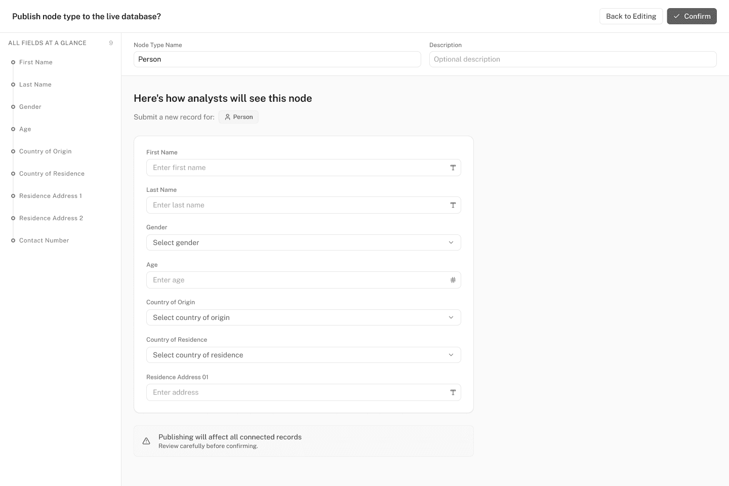
Stage 2: Visual confirmation. Before anything goes live, designers see the form exactly as analysts will encounter it — a true What You See Is What You Get preview. If something looks off, they can step back and edit. Nothing reaches the database until they're ready to confirm.
Interaction concept shown as a wireframe. Actual product screens withheld at the client's request.
IMPACT
Less training needed. Fewer irreversible mistakes. A foundation to build on.
Precise metrics weren't available by the time my contract concluded. But the design delivered structural change:
Reduced training burden — plain language and familiar interaction patterns mean new users can orient themselves without weeks of handholding
Operational safeguards — the two-stage publish flow removes a significant class of irreversible errors
Foundation for growth — a design system the team could build on, rather than a one-off redesign that would drift without maintenance
REFLECTIONS
Three things this project taught me
Friction can be the feature. My default as a designer is to remove obstacles. This project taught me that in high-stakes, low-reversibility environments, a well-placed pause is better UX than a fast path to disaster.
Working without your users demands rigour. No direct access meant I had to be disciplined about where my evidence came from. Secondary research and proxy testing aren't ideal — but done carefully, they're far better than designing from gut feel.
Bringing UX into a tech-led team is its own design challenge. As the first designer in the room, I wasn't just designing a product — I was making a case for why the process mattered. That required as much communication craft as interaction craft.