BRAND & PRODUCT DESIGN
Green Ant — Making Climate Science Comprehensible
Timeline
September – December 2024
Fixed Contract
Team
Principal Investigator (Harvard researcher), 2 Developers, and me (Designer)
Contribution
First and only designer. Brand system, communication collateral, and mapping platform UI — built from a single logo with no prior guidelines.
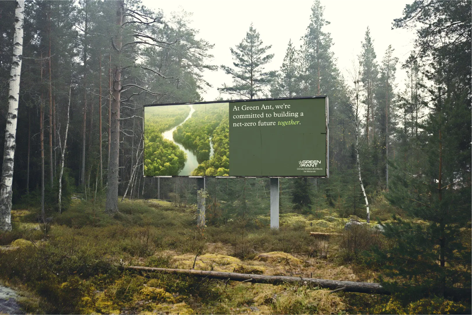
CONTEXT
The science was rigourous. The story wasn't told yet.
THE BRIEF
One logo. No brand system. Three months.
When I arrived, Green Ant only had a single designed asset: a logo — a green ant whose body incorporates a leaf, designed by an external designer. No colour system. No typography. No guidelines. No collateral. No way to communicate who they were or what made their approach different.
My brief spanned two disciplines — designing the interaction layer of a mapping platform and building the brand system that would make complex science comprehensible to a non-specialist audience.
Three principles guided the work:
Comprehensible — complex climate science translated into plain language and clear visual hierarchy, without sacrificing accuracy.
Credible — a visual language serious enough to sit in front of financiers and government bodies, warm enough to engage landowners and local communities.
Coherent — a brand system that could scale beyond my three months, applied consistently across print, digital, and environmental touchpoints.
THE SYSTEM
Four outputs, one visual language
Brand Guide
Built from the green ant logo outward. A five-colour palette anchored by Verdant Green — a deep forest green that communicates environmental commitment without greenwashing cliché. Typography pairs Neue Haas Grotesk Text Pro with Plantin MT Pro.

The visual language draws from editorial references — bold geometric shapes, cut-out imagery, strong typographic hierarchy — appropriate for an organisation that is, at its core, a research institution that also needs to be a brand.
Communication Collateral
A trifold brochure designed for events and stakeholder meetings — already printed and distributed publicly. The challenge: communicating the scale of the opportunity (peatlands store twice the carbon of all the world's forests combined, despite covering only 3% of land surface) in a format a non-specialist could absorb in two minutes.

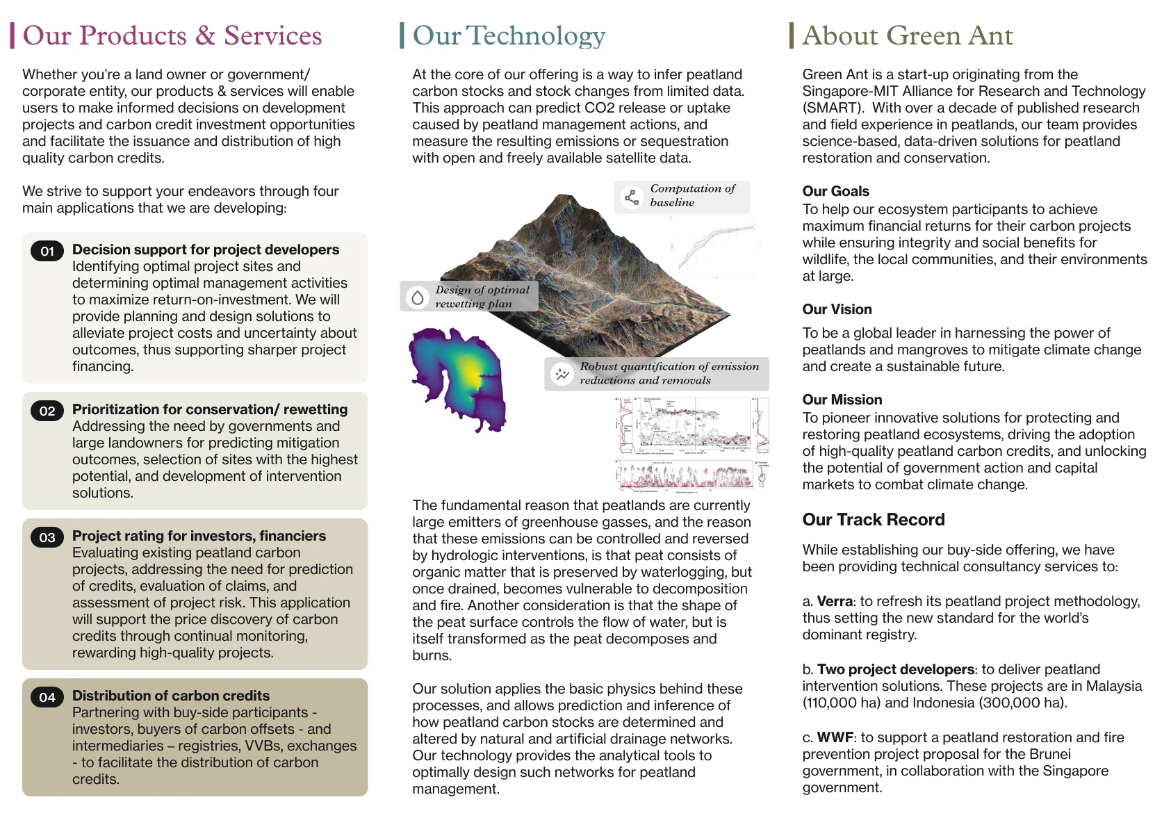
The challenge: making the scale of the opportunity comprehensible in under two minutes, to an audience who didn't need to understand the science, but needed to trust it. Brought to the Singapore FinTech Festival 2024, where it opened conversations with potential investors and project developers in the sustainability space.
The Playbook
The centrepiece — and the most intellectually demanding piece of the engagement. The researcher's methodology is genuinely novel. My job was to digest his notes and make that comprehensible to someone who isn't a climate scientist. Not to dumb it down — to translate it.


Sensitive content has been blurred to respect confidentiality. The core design challenge was editorial as much as visual — structuring and laying out a complex scientific methodology so that a non-specialist could follow the argument without losing the rigour behind it.
Mapping Platform UI
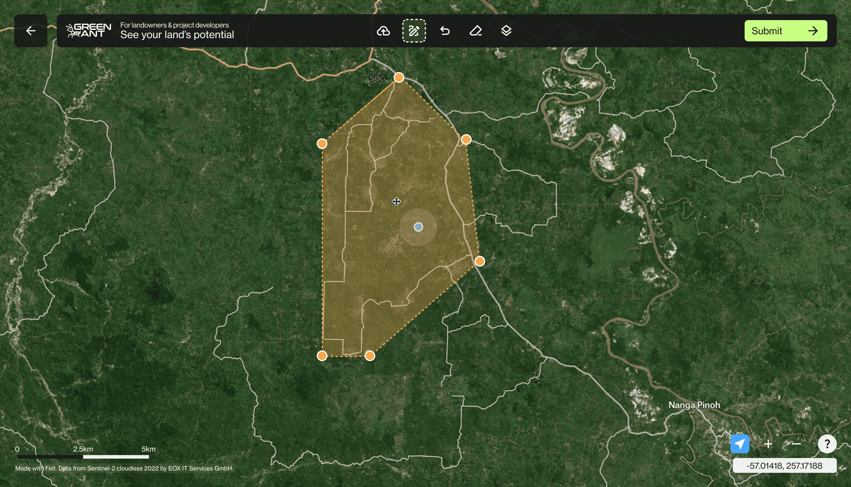
A customer-facing tool for landowners and carbon project developers to map areas of interest and calculate their land's carbon credit potential. Two primary screens: a satellite view where users draw or upload their land boundary, and a global peatland map with toggleable scientific data layers. The UI exists to get out of the map's way.

IMPACT
Here's what actually shipped.
A full brand system, built from a single, ungoverned logo into a five-colour palette, a typography pairing, and a visual language coherent enough to scale beyond the engagement.
The mapping platform went live — landowners and project developers could define their land and see its estimated carbon-credit potential. It was an early iteration, handed off at the end of a three-month contract, so I don't have visibility into how it's evolved since.
A trifold brochure — already printed and publicly distributed — that opened investor and project-developer conversations at the Singapore FinTech Festival 2024.
The playbook: a genuinely novel scientific methodology translated into a document a non-specialist could follow without losing the rigour behind it.
REFLECTIONS
Three things this project taught me.
Some of the most important work here was invisible: learning enough about carbon markets, peatland hydrology, and the voluntary carbon standard (Verra — the world's leading carbon crediting programme) to have informed design conversations with scientists and researchers. That domain knowledge shaped every decision, from which data to surface in the brochure to how to sequence the playbook's argument.
Making complex things comprehensible is its own discipline. Understanding the science well enough to translate it — without distorting it — required as much time reading and asking questions as it did designing. The designer's job in a research context isn't just to make things look good. It's to understand well enough to make decisions about what matters.
Short contracts demand honesty about scope. Three months is enough to build a foundation. It's not enough to build everything. The work here is a beginning — a visual language, a communication framework, and a set of tools that Green Ant could grow from. Knowing what to prioritise in that window, and being honest about what had to wait, was as important a design decision as any colour choice or layout.
