BRAND & EXPERIENCE DESIGN
The Tropical Metro — Designing a Transit System That Feels Like Singapore
Project Type
Personal project — ongoing, living study
Scope
Transit map, wayfinding system, in-carriage displays, brand identity, mascot, transit card, app UI

FOREWORD
Built for efficiency. Not quite yet for belonging.
This project began during the quietest period Singapore had seen in decades.
When the borders closed during the pandemic, I found myself rediscovering the city on foot and by train. I spent those months riding to every corner of the island — studying signage across different lines, watching how people navigated stations, documenting the small moments of friction that most commuters had learned to silently absorb.
What I noticed wasn't a broken system. Singapore's transit network is, by any global standard, remarkable. What I noticed was a gap — between the world-class infrastructure we had built, and the human experience of moving through it.
Riding it often feels like being shouted at. Makeshift posters compete for attention. Ads plaster every platform screen door. The map feels dense and clinical. The overall visual language, while functional, feels like it belongs to a different city — not the warm, green, tropical one just outside the station doors.
This project started as a quiet frustration and grew into a much bigger question: what would it look like to redesign Singapore's transit experience from the ground up — not just the map, but every surface a commuter touches? And so, I redesigned it.
THE BRIEF (SELF-INITIATED)
What if Singapore's transit felt like Taipei or Tokyo, and yet still uniquely hers?
Transit systems in cities like Taipei and Tokyo have something Singapore's doesn't — a coherent, considered identity that extends from the map to the signage to the mascot to the ticket card. Riding those systems feels like being looked after. The design communicates: someone thought about you.
Tropical Metro is my attempt to build that for Singapore. Starting with the map — the most fundamental piece of any transit system's visual identity — and expanding outward to every touchpoint a commuter encounters.
The three design principles that guided every decision:
Intuitive — reducing cognitive load (the mental effort required to process information and make decisions) at exactly the moments when people are most rushed or most unfamiliar with their surroundings.
Inclusive — serving the full diversity of Singapore's ridership: the elderly commuter, the tourist navigating their first interchange, the non-English-speaking resident, the wheelchair user, the child on their first solo journey.
Grounded in identity — reflecting Singapore's warm, green, tropical character rather than borrowing the visual language of a European metro or a clinical airport terminal.
PROPOSED SOLUTIONS
Various touchpoints, one visual language
Transit Map
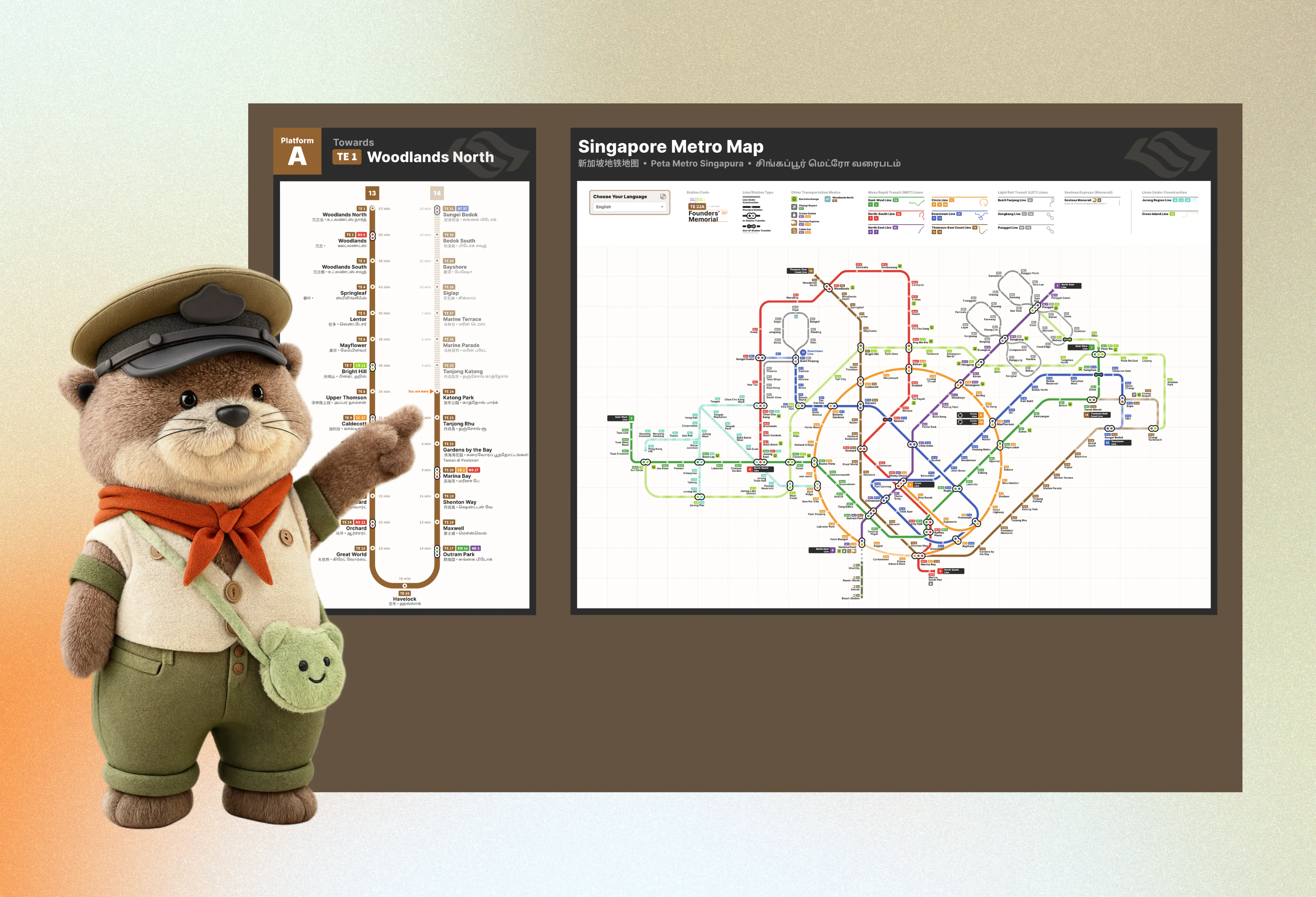
The map redesign builds on the principle established by Harry Beck's original London Underground map (designed in 1931) — already the basis for LTA's current system map — that a transit map doesn't need to be geographically accurate, it needs to be legible. This redesign pushes that clarity further: straight lines, consistent angles, and a warmer, more editorial colour and type language.
Left: the official and current system map © Land Transport Authority Singapore. Right: an independent redesign, not affiliated with or endorsed by LTA.
This mockup includes planned lines (Cross Island Line, Jurong Region Line) for a fuller conceptual picture. Naturally, a production-ready version would show only currently operational lines, consistent with the "current system map" framing on the left.
View on
Language Picker
All four official languages of Singapore — English, Mandarin, Malay, and Tamil — form the foundation, accessible through a language picker in the legend. Languages from Singapore's most commonly-visiting nations — Korean, Japanese, Bahasa Indonesia, and others — are included as well, building genuine accessibility for the full range of people who ride this network.
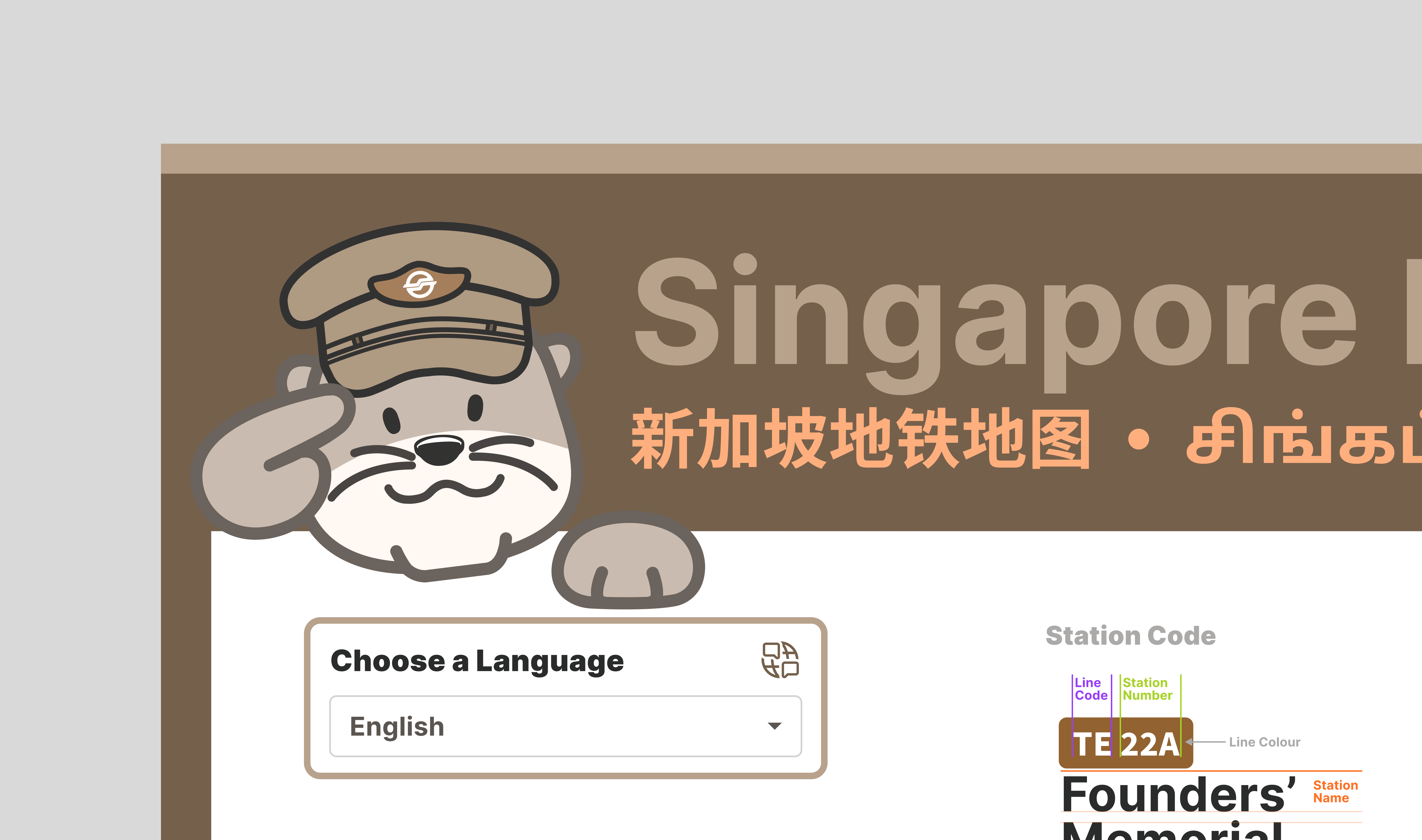
Concept: a language picker in the legend extends beyond Singapore's four official languages to include Korean, Japanese, Bahasa Indonesia, Tagalog, Vietnamese, Hindi, German, and other languages commonly spoken by visitors — reflecting Singapore's full ridership, not just its residents.
In-Station Wayfinding & Platform Signage

Directional signage (top) guides commuters to key destinations — hospitals, transport links, civic buildings — with icon, arrow, and quadrilingual labelling. Station identification signage (bottom) confirms the current stop and its interchange lines at a glance.
In-Carriage Display
The most practically useful piece of the system. The display shows the next station, which platform doors will open, which exits lead where, and a cross-section diagram of the carriage — marking the exact position of lifts, staircases, and escalators at that specific station.
Singapore's actual MRT doesn't surface this information clearly at the moment you need it most: while you're still seated, with time to move toward the right door. The display answers the question before the commuter has to ask it.

Train LCD panels currently flash a 3D station schematic before arrival — useful information, gone before you reach the decision point it was meant to prepare you for. This proposal replaces it with a simple 2D diagram that requires less cognitive load. It simply tells you which carriage you're in and where to turn for your desired exit or destination.
Otto — The System's Character
Otto is a smooth-coated otter — native to Singapore's waterways, playful but purposeful, at home in the tropical environment. He wears a station master's uniform: a peaked cap, a terracotta neckerchief, a small frog sling bag. Authoritative and approachable in equal measure.
In the context of the brand, Otto is the emotional layer — the face on the transit card, the guide in the app, the character that makes an otherwise utilitarian system feel like it was made with warmth. His illustration style uses flat graphics with a consistent stroke weight, so he reproduces clearly at every scale from a card-sized print to a station billboard.
Cities like Taipei and Tokyo have mascots that commuters recognise and feel affection for. Otto is Singapore's answer to that.

Otto is a smooth-coated otter native to Singapore's waterways — authoritative enough to be trusted, warm enough to be loved. Here he is modelled in 3D and embedded as a live interactive component.

OttoCard
The physical transit card — the most intimate touchpoint in the system, handled daily, tucked into wallets, lost and replaced. The OttoCard brings Otto into that everyday moment. Card details, fare balance, and trip history are managed in the app in plain, friendly language.


Card details, fare balance, and expiry — all in one place. Otto included.
OttoApp
The app handles journey planning and real-time navigation, visualising each leg of the journey from point A to B and the time required at every step.
The goal is simple: make public transport feel like the desirable choice — not just the practical one.

Journey planning that respects your time and your choices.
REFLECTIONS
Designed with care. And a contribution to the conversation.
The portable clip stands, the makeshift advisories, the overcrowded entrance points during rush hour — these aren't solved by a better-designed sign alone. A more complete answer involves a combination of designed touchpoints, proactive digital communication, and ground staff who can respond to what a screen cannot. Service design (the practice of designing the full ecosystem of human, digital, and physical interactions — not just individual touchpoints) is the right frame for some of these problems. This study is a contribution to that conversation, not a conclusion of it.
The redesigned map was shared with daily commuters on social media to sense-check the proposals against lived experience — a lightweight validation rather than a formal study. Some proposals are resolved. Others remain deliberately open.
This study stands on the shoulders of independent designers and enthusiasts — including Samuel Lim and Faiz Basha — who have contributed meaningfully to the ongoing discourse around Singapore's transit map. The Tropical Metro seeks to be part of the same conversation, offered in the same spirit of care for this city and everyone who moves through it.
