Company
Singapore-MIT Alliance for Research & Technology (SMART)
Role
User Experience Designer
Team
2 x Developers
Duration
3 Months
Contribution
UX and UI Design
Branding Identity
Marketing Collaterals
Website
Impact
Delivered a comprehensive brand identity and component library, and established a professional visual language that serves as a critical "trust signal" in a high-stakes carbon credit market.
Singapore-MIT Alliance for Research & Technology: Architecting Trust in Carbon Markets
From visual identity to geospatial UI, I established a professional design language that mirrors scientific rigour for a MIT-backed spin-off, ensuring that land-mapping tools felt as accessible and intuitive as they were accurate.
Context
A startup backed by Singapore-MIT Alliance for Research and Technology (SMART) developed a rigorous scientific method for calculating carbon credits via peatland restoration.
While the methodology was groundbreaking, the project lacked a professional digital presence to engage landowners, carbon project developers and investors. I was brought in on a 3-month strategic contract to build the foundational brand identity and a web-based interface.
Problem
Discovery
Through initial stakeholder interviews and a review of the existing technical workflows, I identified three primary hurdles:
The Credibility Gap: As a scientific spin-off, the project needed to move away from "academic prototype" aesthetics toward a professional "Climate Tech" brand to win investor trust.
Input Fatigue: The process for calculating carbon potential involved highly specific geospatial data. Without a guided, intuitive UI, the experience for landowners and carbon project developers to map their interest may feel like a daunting technical hurdle rather than a business opportunity.
The Gap Between Methodology and Interaction: The "magic sauce" lived in a complex methodology rigorously developed by the principal investigator. My challenge was to translate this methodology into an intuitive spatial input tool as well as a digestible handout for communication purposes. I had to ensure that non-expert landowners and carbon project developers could provide geographic data with a fidelity as high as possible without being overwhelmed by technical complexity.
Key
Constraints
In climate-tech, there is an inherent tension between scientific integrity and user adoption. The primary challenge of this project was navigating the disparity between the high-stakes data requirements of carbon registries and the practical realities of user input.
Integrity vs. Adoption: My role was to manage the trade-off between providing a low-friction entry point and maintaining the strict verification standards required for market credibility.
Managing Perceived Authority: I had to ensure that while the initial interaction was approximate and accessible, it did not compromise the user’s perception of the project’s underlying scientific authority.
The "Accuracy Gap": I designed a workflow that allowed for an "accessible estimation" phase, which successfully lowered the barrier to entry without diluting the professional rigor expected by external stakeholders and carbon-credit purchasers.
Methodology & Strategic Approach
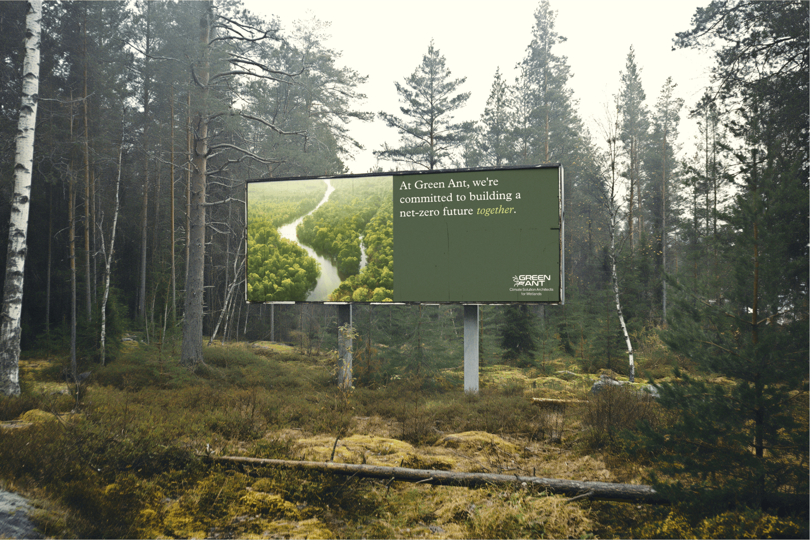
Multi-Channel Information Design: Recognising that a simple UI cannot communicate a complex scientific methodology alone, I developed a hybrid physical-digital strategy. Here, I designed the marketing collaterals to serve as the "technical primer." The brochure handles the heavy lifting of explaining the methodology and the importance of future precision (i.e. strict verification with established carbon registries such as Verra or Gold Standard), allowing the UI to remain clean, focused, and high-converting.
Protecting Data Integrity through Visual Confirmation: To ensure the methodology remained credible despite rough/approximate user inputs, I focused on visual feedback loops. For instance, when a user draws an area using the simple polygon-mapping tool, the UI provides immediate spatial context (acreage, vegetation density, etc.). This forces the user to subconsciously "audit" their own selection against their real-world knowledge, increasing the accuracy of the "approximate" data before it ever hits the backend.
Design Transformations & Rationale
01
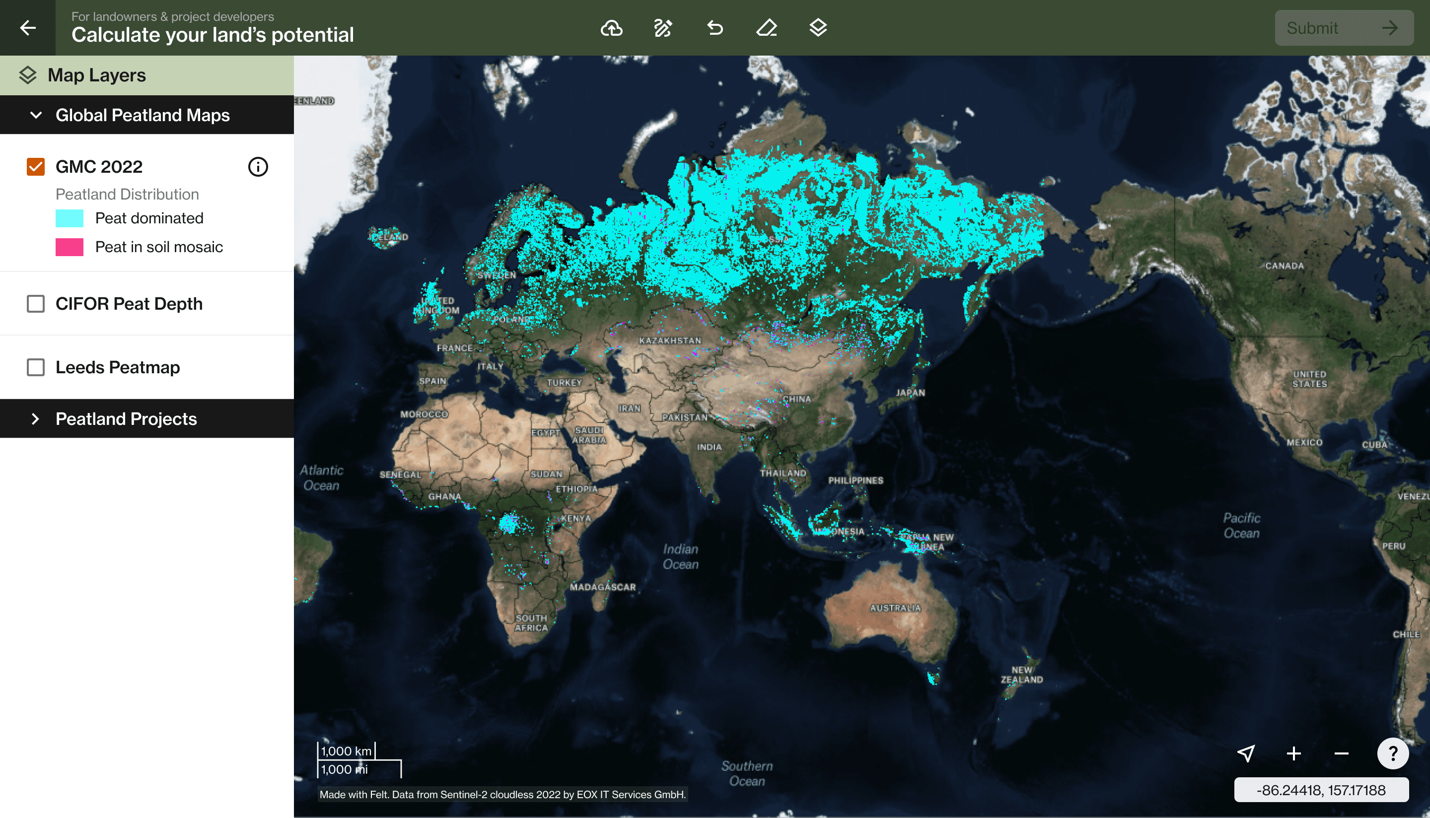
Spatial Identification & Mapping Tool
To bridge the precision-accessibility gap, I designed a geospatial interface that prioritises visual mapping over precise data entry. This allows landowners to visually define their "Area of Interest" (AOI) directly on satellite imagery with relative ease, facilitating an intuitive starting point for the complex carbon-estimation methodology.
Design Rationale
Reducing Friction through Visual Recognition: By allowing landowners to visually identify their land rather than inputting technical coordinates or GIS files, I reduced the initial cognitive load. This follows the principle of accessibility, ensuring that the first step into a complex scientific process feels reachable for any layperson.

02
Future-State Exploration — Adaptive Feedback Loop (Not Validated or Implemented)
I proposed an adaptive feedback loop that provides real-time spatial context — such as acreage and vegetation density — immediately after a user maps out an area. This prompts an "internal audit," which serves to invite landowners and carbon project developers to verify the approximately-mapped AOI against their real-world knowledge before further submission.
Design Rationale
Enhancing Data Integrity through Visual Confirmation and Strategic Friction: While UX often aims to remove friction, I proposed a layer of intentional friction to invite the user to cross-check their approximate data input before submission. This step acts as a quality-control layer to help mitigate the risk of user error while using this simple polygon mapping tool.
Critique of My Own Design
While this feature could potentially enhance data integrity, it introduces a substantial layer of backend validation complexity. Providing real-time metrics requires high-speed geospatial queries against massive environmental datasets, and if the backend cannot process this in real-time, the experience could fail to feel responsive.

03
Multi-channel Information Design
I developed a suite of physical and digital assets — ranging from marketing brochures to informational landing pages — to serve as a conceptual foundation to the complex underlying methodology. This ecosystem prepares landowners and carbon project developers for the complexity of the carbon-estimation tool before they begin the mapping process.
Design Rationale
Defining a Scalable Brand Identity: Starting only with a standalone logo provided by a freelance designer, I conducted extensive market research on the carbon and sustainability industry to build a comprehensive visual language from the ground up. Without an existing style guide, I established the typography, colour palette, and information architecture to ensure the brand felt authoritative and native to the environmental/climate tech sector.


Impact
Architecting Trust: Established a credible visual language and designed a clear mapping interface which is vital in an industry often susceptible to data integrity challenges.
Building for Scalability and Continuity: Delivered a "mini" design system and brand guidelines that allowed the development team to maintain visual integrity independently after my contract ended.
Launched the Commercial Foundation: Successfully transitioned the project from an internal research tool to a market-ready digital platform.
